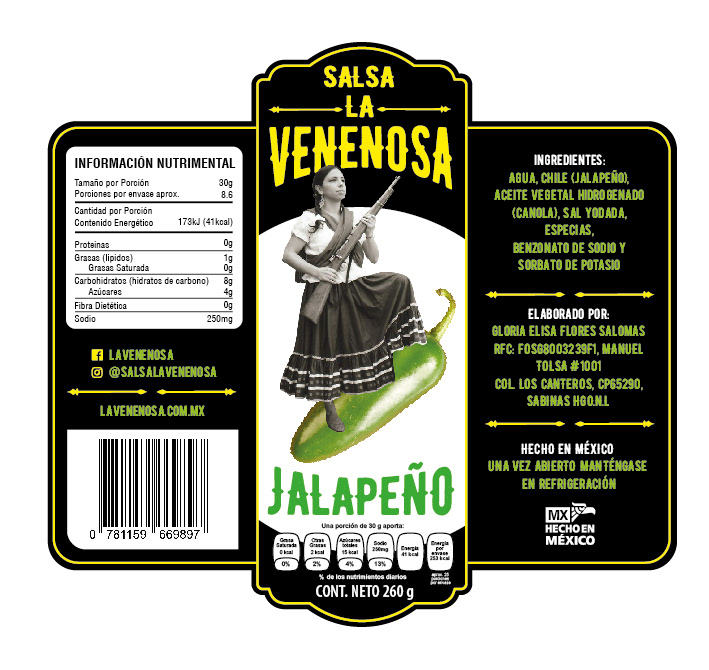
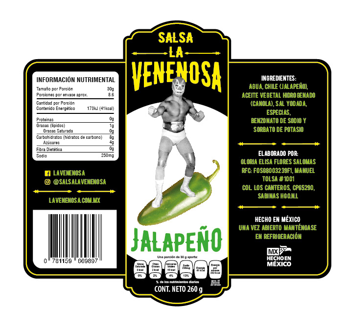
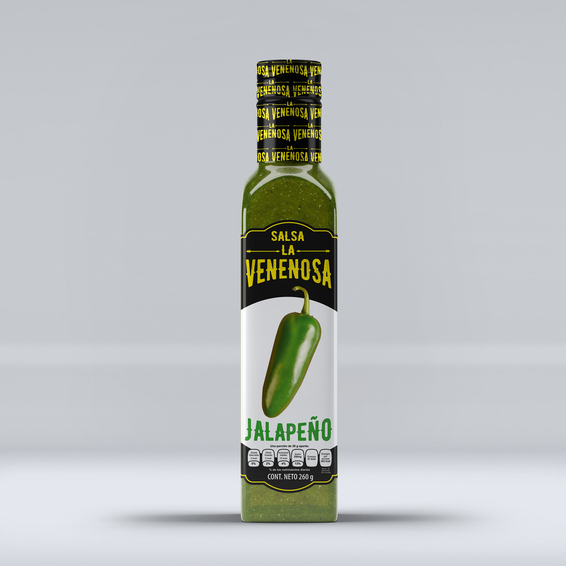
Logo and label design for Salsa La Venenosa from Nuevo León (Mexico). The client requested a "classic Mexican hacienda" design, but at the same time, it should stand out among other salsas due to the choice and contrast of colors.
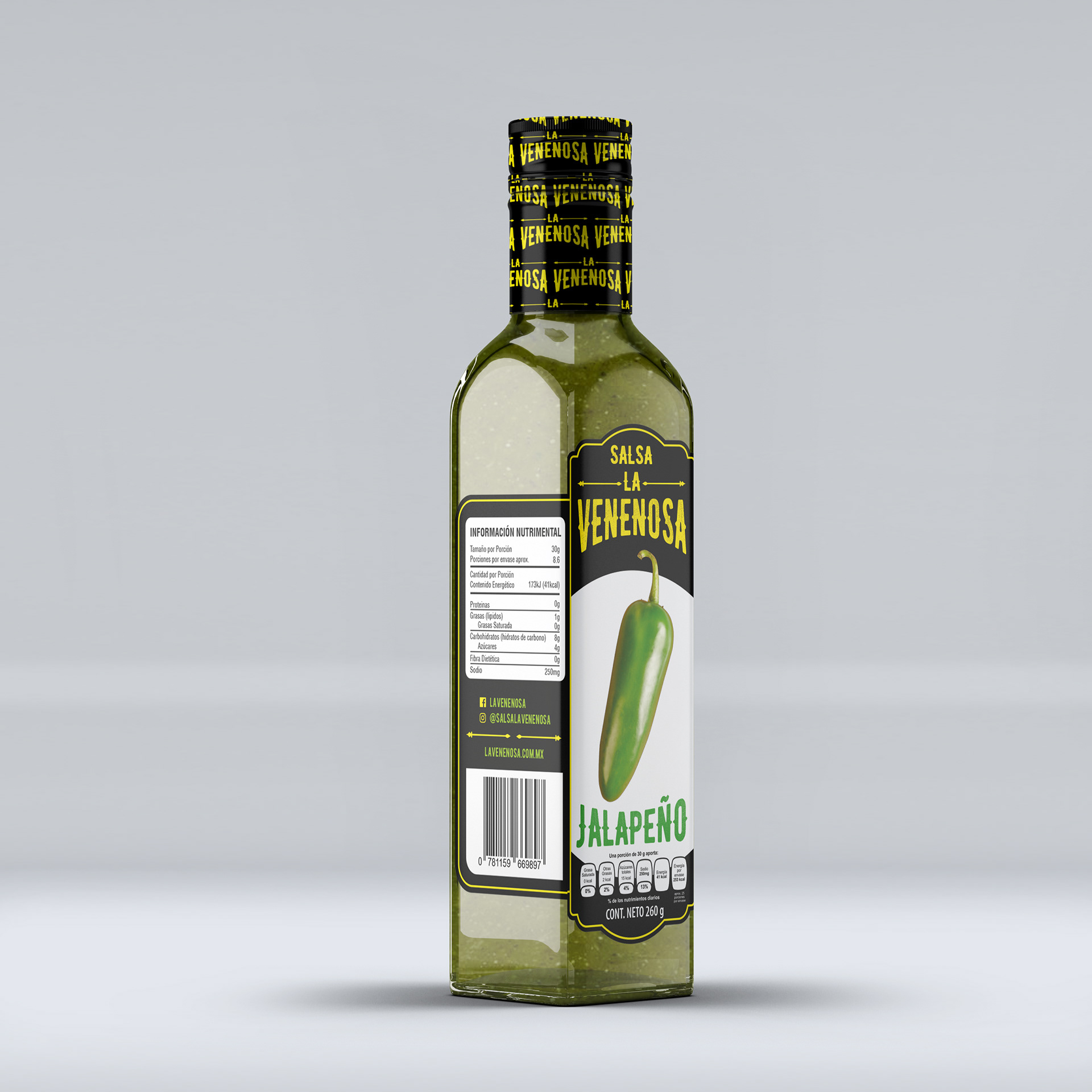
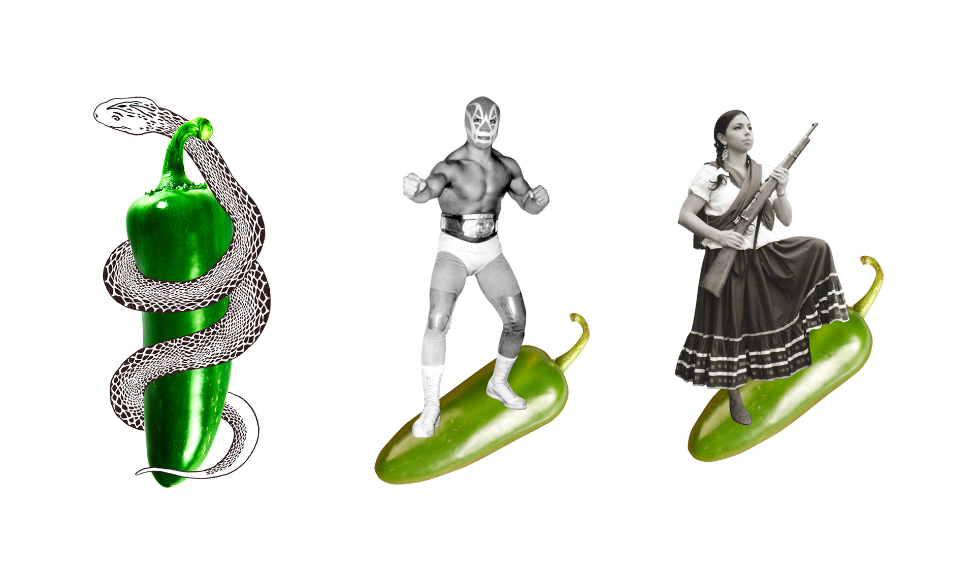
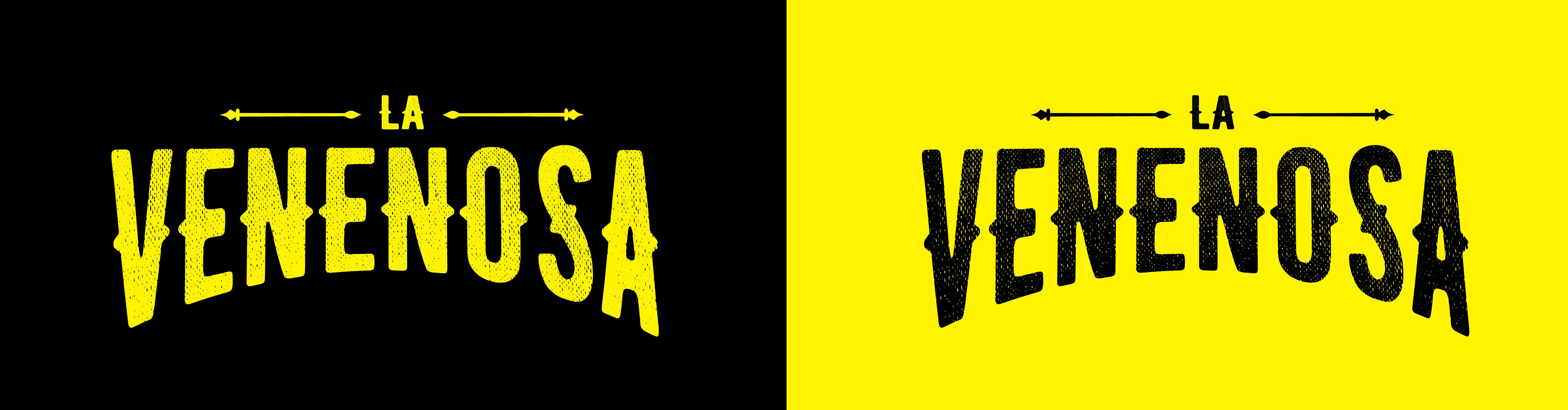
The client chose an unusual and very attention-grabbing name for a food product, but it makes perfect sense in the context of Mexican hot sauces. We wanted to give it a bold design, like a fugitive from the Mexican Far West (just a reminder that Texas was once part of Mexico).
The choice of a single Jalapeño was a direct idea from the client, who wanted the front to be simple and clear compared to the market competition.

Before reaching the final result, several different options were explored, with designs that strayed from the typical Mexican mezcal brands, aiming for a distinctive look on the shelves.
At Vectorlance, we enjoy exploring, experimenting, and, together with the client (who always has the final word), deciding on the path that best fits what they have in mind.